|
I have many sketchbooks and little notebooks of painting ideas that I think up often. In the case of these “Animal, Vegetable or Mineral” paintings, the thinking up the puzzle-like process of piecing together the elements, features, or categorical states of being can easily entertain me. Nevertheless, when I can’t find the time to actually get out my paints to develop these ideas for paintings, the ongoing compilation of composition visions can pull me into a state of over analyzing the possibilities and the what and why of the different pieces of my imagined pictures before I even pull out my brushes. In my intentions for this project I made-up, that over analyzing before I even start to illustrate is not necessarily a wanted part of the creative process as I’d like to just take the ideas as they come when I actually get to the point of putting paint to canvas. That is the way I usually approach my artwork, creating as I go. For me, the working through my paintings and then reviewing what I see and perceive in them and the feelings the process of creating may bring to light becomes the main value of the artwork as I understand it along with the appreciation of the meaningfulness of the process or the creative ‘journey’ itself. For this canvas #14 in my “Twenty Questions/Animal, Vegetable, or Mineral?” painting exercise, that strait spontaneity without prior preconceptions was where I came from for the art. In this new year when I found some extra time for this project, I decided to ignore all the previous ideas and layers of notes thinking of different animals and vegetables and minerals for different compositions and just go ahead and paint this model I had just come across in one of my old magazines. One of the reasons I decided on this model for canvas #14 is simply because I wanted to paint her curly hair. Since I found this figure just before beginning to paint, the other elements were just filled in as I went along continuing to cover the canvas. For an animal feature, on her lifted finger I put a dragonfly because a dragonfly just randomly came to my mind at the time. Then for the mineral elements I added to the background a street of concrete lined with paint and telephone wire. A little Goggle research had me questioning what the technical classification of old tall tree trunks known as phone poles to hold telephone wire would fall under, but the grassy green field on which the poles stand and the road rolls made sure to suggest plenty in the picture that can count for what be could be classified as ‘vegetables’ in this “Animal, Vegetable and Mineral” painting project of mine. Find an explanation about my painting exercise in the following blog: “Is It Bigger Than A Breadbox? ‘TV Land’, ‘Saturn’, ‘December’ and ‘Parrot Wallpaper’ ” Canvas #14: Telephone Poles, A Dragonfly, and Other Images  Some process pictures in various lighting and at different stages of painting: 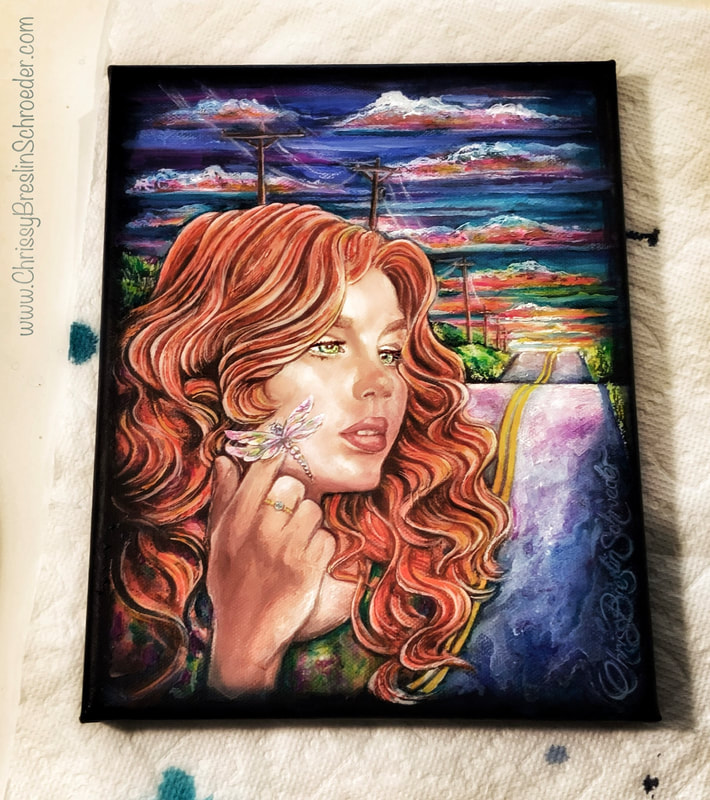 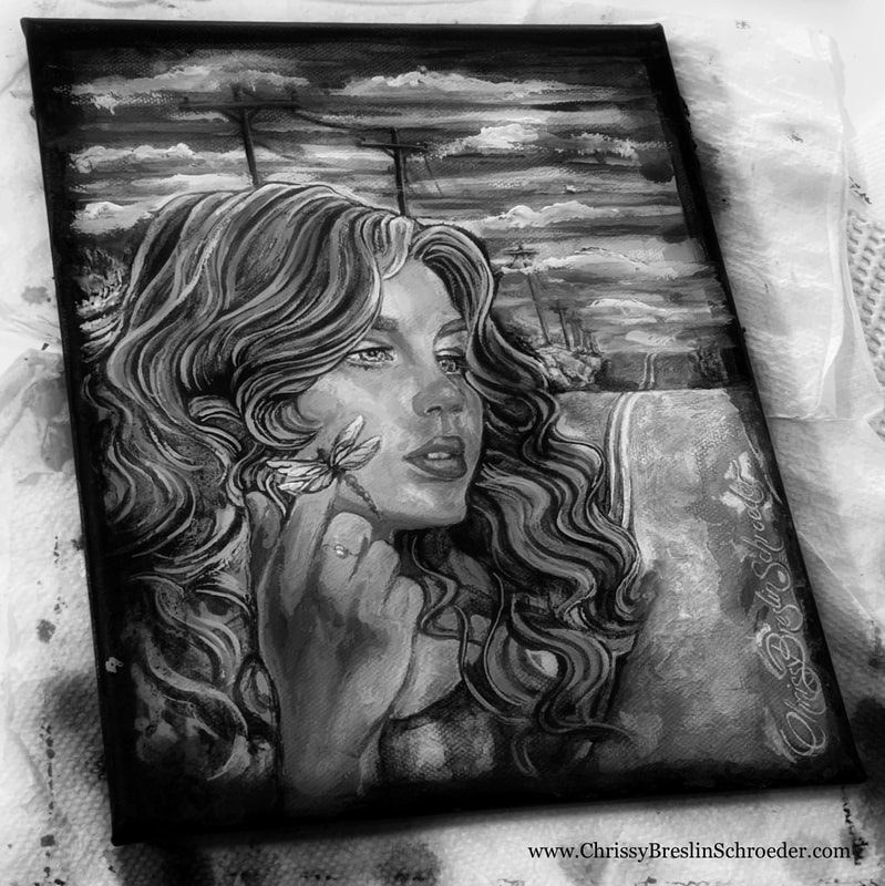 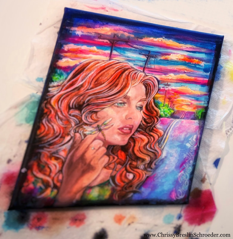 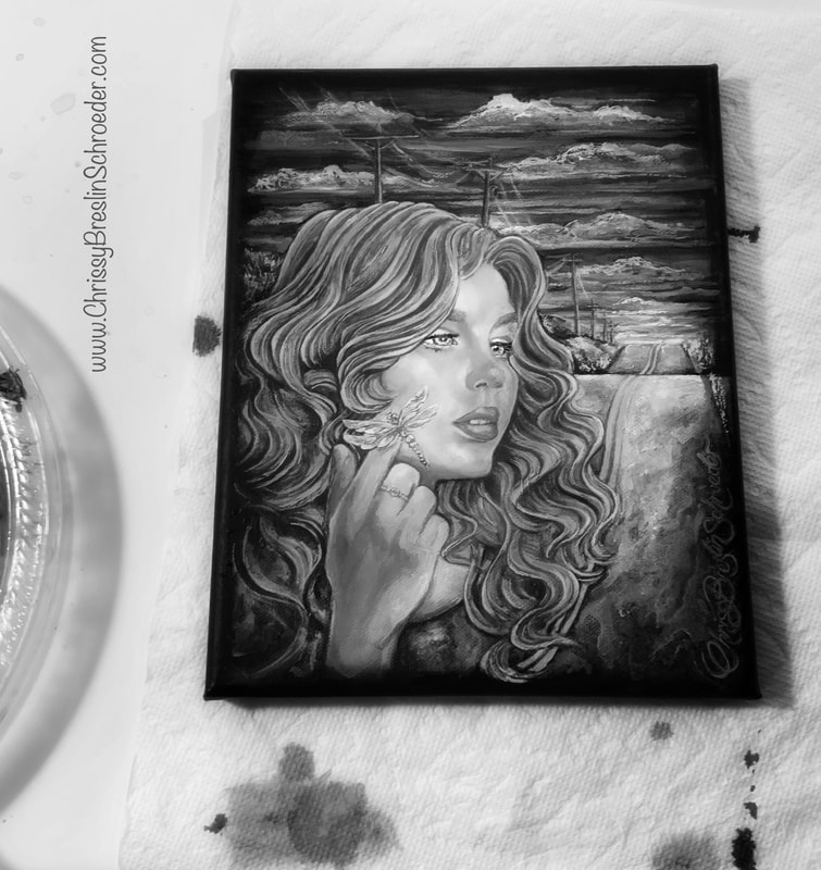 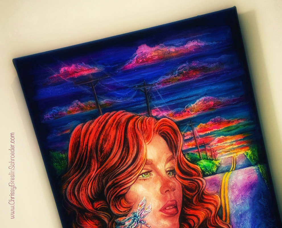 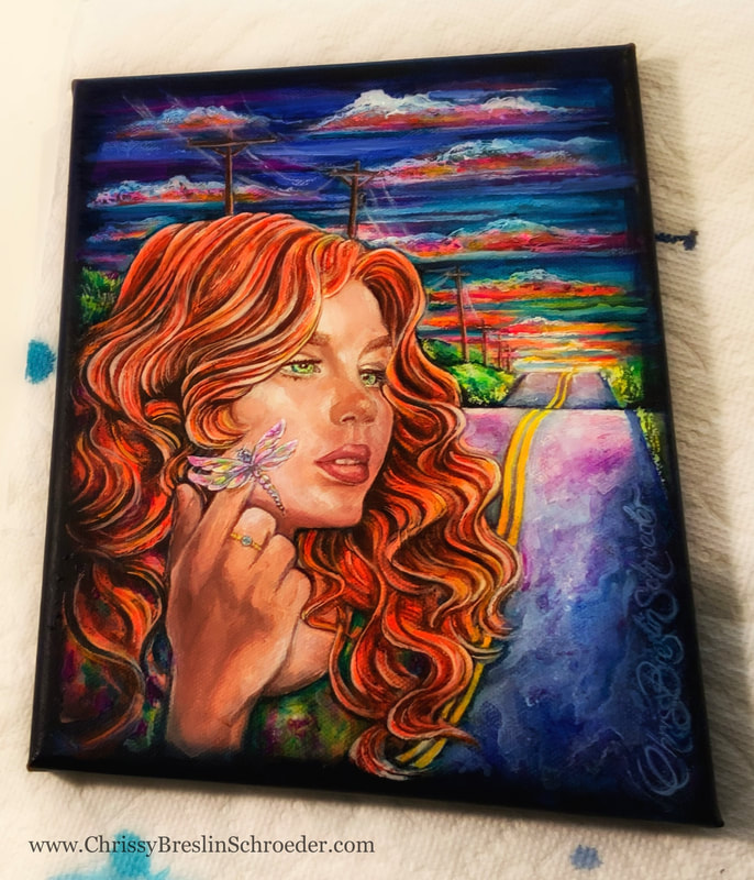 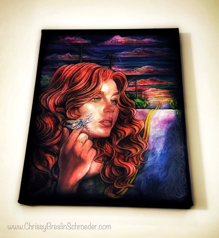 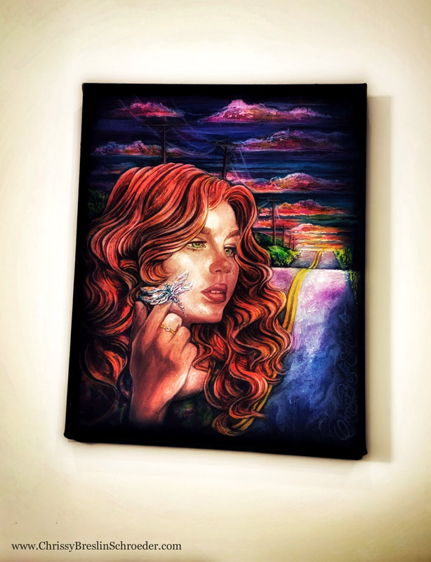 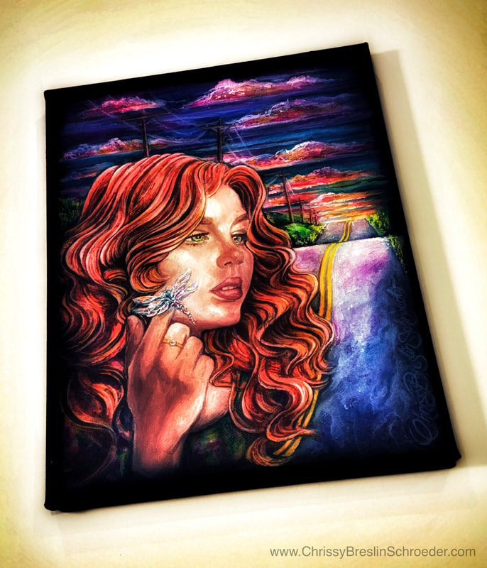 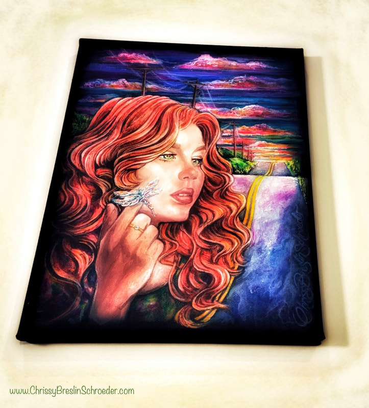 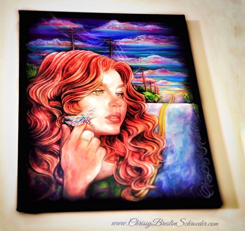 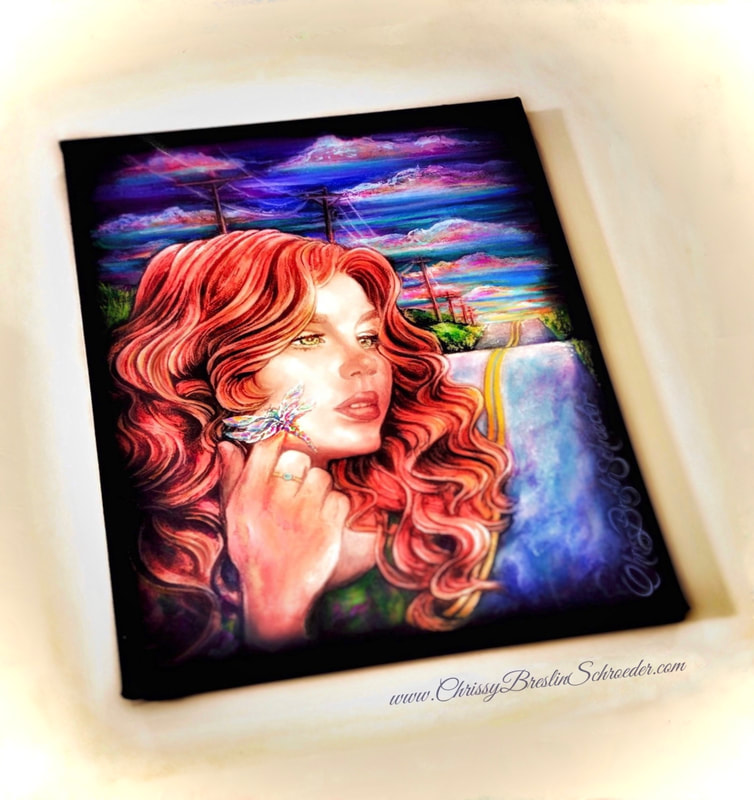 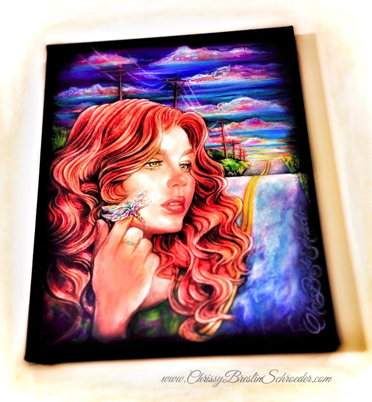
0 Comments
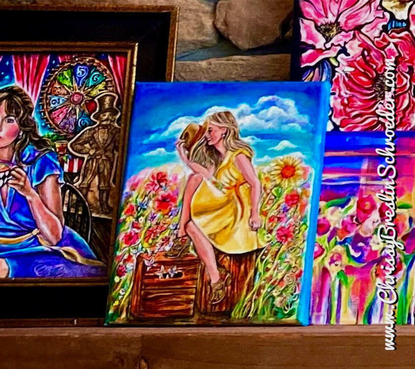
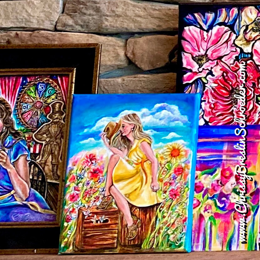
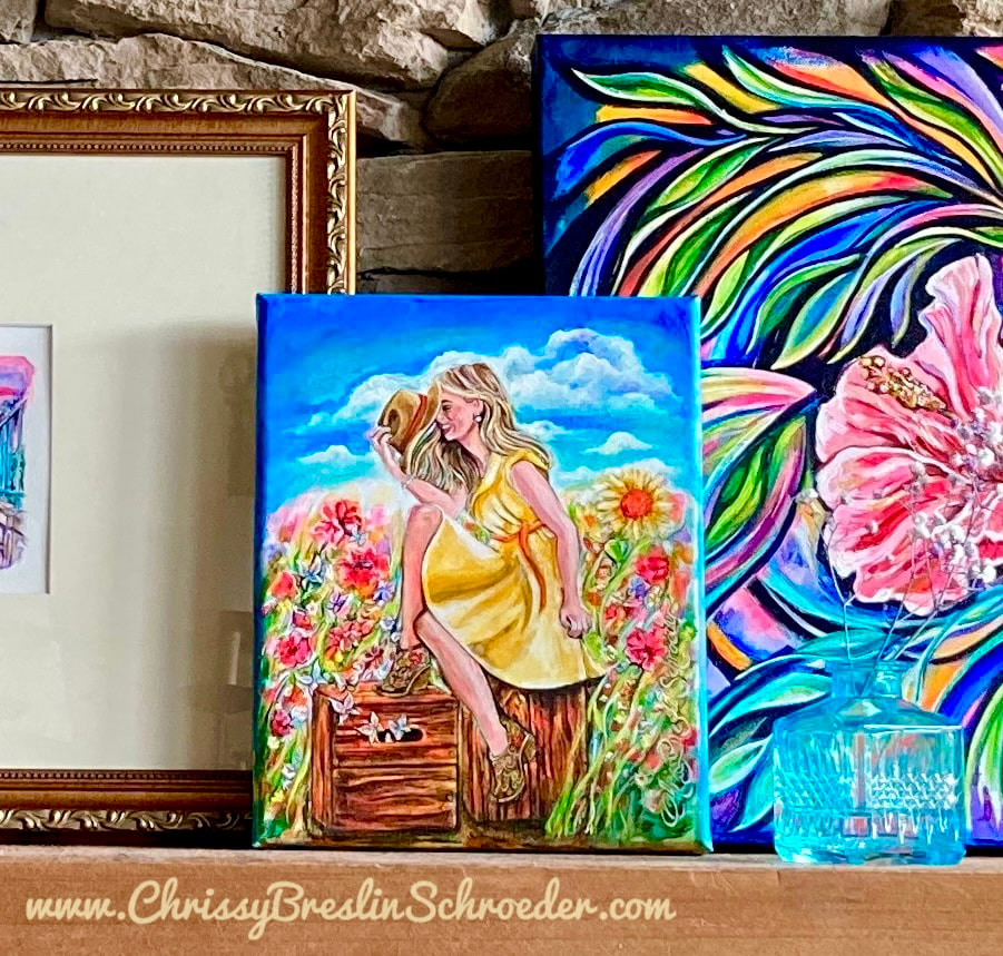
Season’s Greetings Warm wishes for the season and a snapshot of one of our fireplace mantels with holiday lights and a few old and new paintings including some Christmas Card paintings from Christmases past. Paintings: Christmas Cards with Little People in the Season of Peace & Joy Lacing Skates Good Tidings of Comfort and Joy with Merry Memories of Moxie 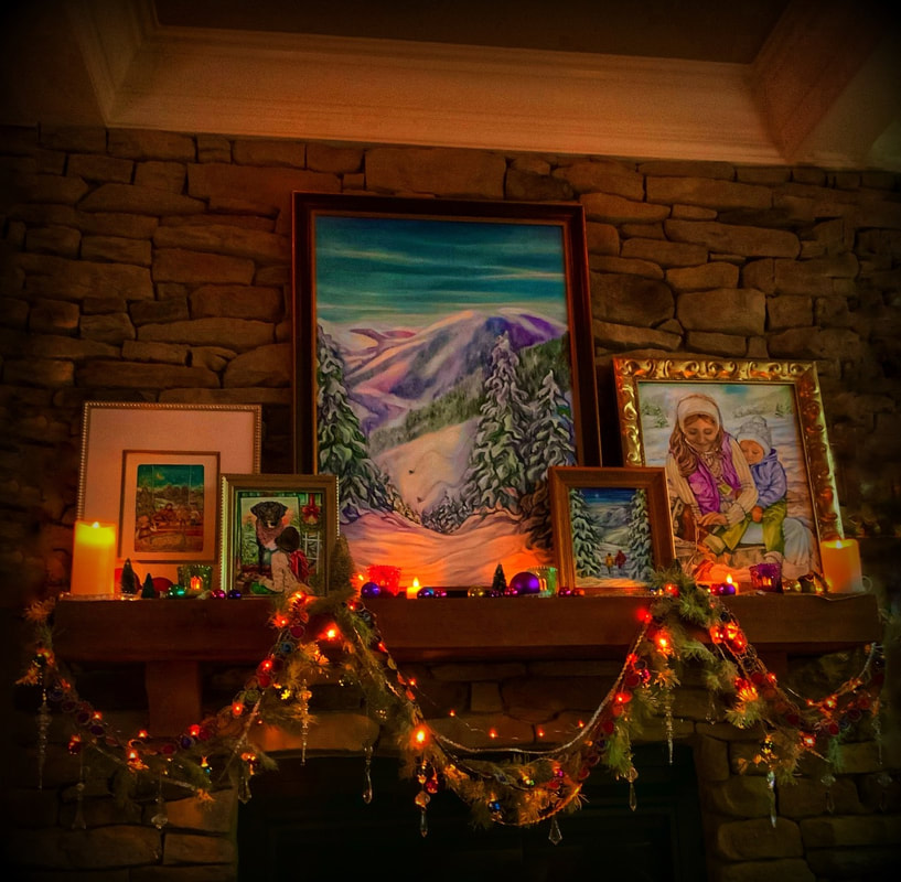 Like Canvas #12 in my “Is It Bigger Than A Breadbox?” / “Twenty Questions” / “Animal, Vegetable, or Mineral?” painting project, my Canvas #13 also touches on the subject of school. Read about the numbered canvas project I made-up here: "Is It Bigger Than a Breadbox?" My canvas #13 is a painting of a painting of the family dog from my kids’ childhood years. I created the composition to include what can be classified as vegetables as well as what can be classified as minerals by painting our old dog in a holiday setting with a candle, a strand of garland, evergreens, and a wreath plus red bows, paints, and brushes. We got our black and white bellied rescue dog in the early 2000’s when our kids were just starting primary school. Being that everyone in my family has their birthday in May ( except mine ), we named the rescue puppy “Moxie May” and called him “Moxie”. Since the beginning of school days for the kids, Moxie stayed close to our side ( literally for me, when I was the only one home, he was never less than a foot away from me as he followed me everywhere ) filling our home with love, comfort and joy from those very first days of school until the kids were off to college. We treasure all those years with Moxie by our sides and recognize what a central part his love and companionship was to our family. One of my favorite memories of the love, loyalty and joyful warmth Moxie brought to our home can be traced back to each and every morning when it was time to catch the school bus. The school bus stop for us was very convenient to reach considering it was just right out our front door at the end of our driveway. Of course when the kids were very young, their dad or I would walk with them to the end of the driveway to catch that step onto the bus, but as we all got a little older we felt it was fine for me to simply wait with my coffee at the front door for the wave. Moxie, however, never saw things that way. For him the walk to the bus stop was not something he was going to let go of. Moxie never stopped seeing that walk from the door to the end of the driveway as a principal part of his day; and I remember watching his loyal dedication to it. I love remembering how at the end of the driveway, after the kids jumped onto the school bus, Moxie would attentively stay and stand watch as the bus drove off, and down the street, and past the stop signs, and around the bend until it reached the horizon and disappeared. It was at that point in time where he would gently nod his head down, make a direct 180 degree turn, and begin his journey back up the driveway. In his ritual, Moxie then proceeded to continue strait back up the winding driveway. Some days I remember him having an energetic, hopping skip in his steps and others just a calm, peaceful evenness to them. All the same, he always carried on his course up the driveway until he reached the walkway which lead to the house. It was there where the walkway branched off the driveway that he then consistently progressed with a clear 90 degree turn towards the front door where I was waiting. After making the turn, Moxie would then ceremoniously steadily continue on step by step along the curving walkway. He continued on step by step along the curving walkway until he reached the stoop where he happily hopped up to get to the front door step at which point he would stop at the toes of my feet and look up directly into my eyes with a sense of peacefulness and accomplishment as if to say, “The kids are alright. I saw them off and safely on their way.” He did this each and every day. “Good Tidings of Comfort & Joy with Merry Memories of Moxie” 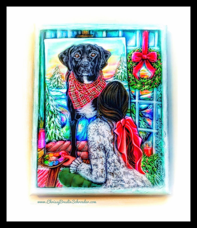 I still keep a charm of Moxie on my vanity dresser since the fall of 2016 when he passed away, which in some ways feels so long ago but in other ways just like yesterday. 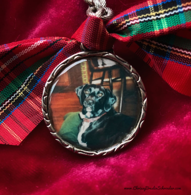 There was a time when my kids were younger that dogs were the main subject of my paintings. I painted many of them until around the time that my boys reached high school and I found a little more time to begin an art print business with the subject of baseball. I then painted quite a few baseball players. Like our dog Moxie seeing the kids off to school and then a baseball player who attempts a journey around a diamond, in retrospect, going off into the world and then getting back to home safety is an apparent theme here. Some of those old dog paintings including our rescue dog Moxie as a painted pup can be found in the blog linked below ( as well as my grown boys’ painted dogs of their own that they each got in 2020, the year of the Covid pandemic quarantine. ) : The Joys Found in 2020 A little more from Christmases Past: When I was a kid my family also had a black dog ( named Schmoe ). We also had a cat ( named Squeaky ). They were around for most of my childhood as I can remember. ( I don’t know who named them, I imagine one of my three older brothers or my three older sisters. ) Back then, I would also wear big bows in my hair and I loved to wear overalls that were in style and that pictured green and orange umbrella patterned blouse with its long 1970’s pointy collar. Unlike my kids who rode a bus however, I walked to elementary school. …And often my dog followed me (or my brother or sister). More than a few times Schmoe was known to walk through the school doors and roam the halls awhile. Schmoe was pretty low key about it all. There were Squeaky stories too. …But those were different times and different days. 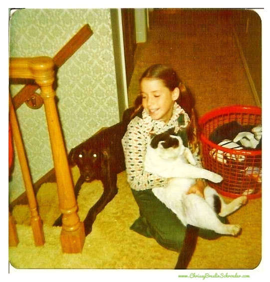 Throughout the year I pull out old paintings when decorating for the seasons. Here are some of them I currently have up on one of our fireplace mantels for All Hallows’ Eve. Read about the pieces through these links: “Vintage Halloween Masks” “Cosmic Peacock” “Saturn” { Saturn. …Just typing the word “Saturn” today brought to mind one of the world’s great gems - - couldn’t help but shine light on a review of the all time genius of S. Wonder and a piece from his beyond great Songs In The Key Of Life album… Some timely lyrics and music for the world: “Saturn” by Stevie Wonder } The Owl Painting can be found in these blogs: “First Day of Fall” “Winter 2021” 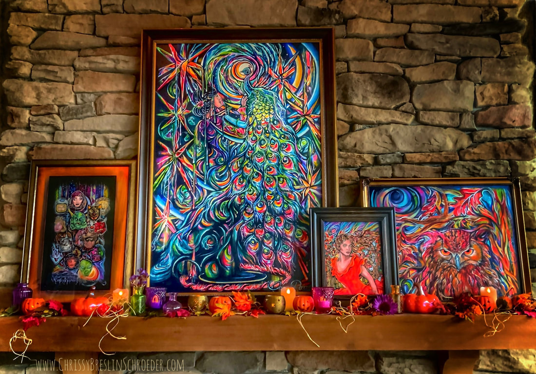 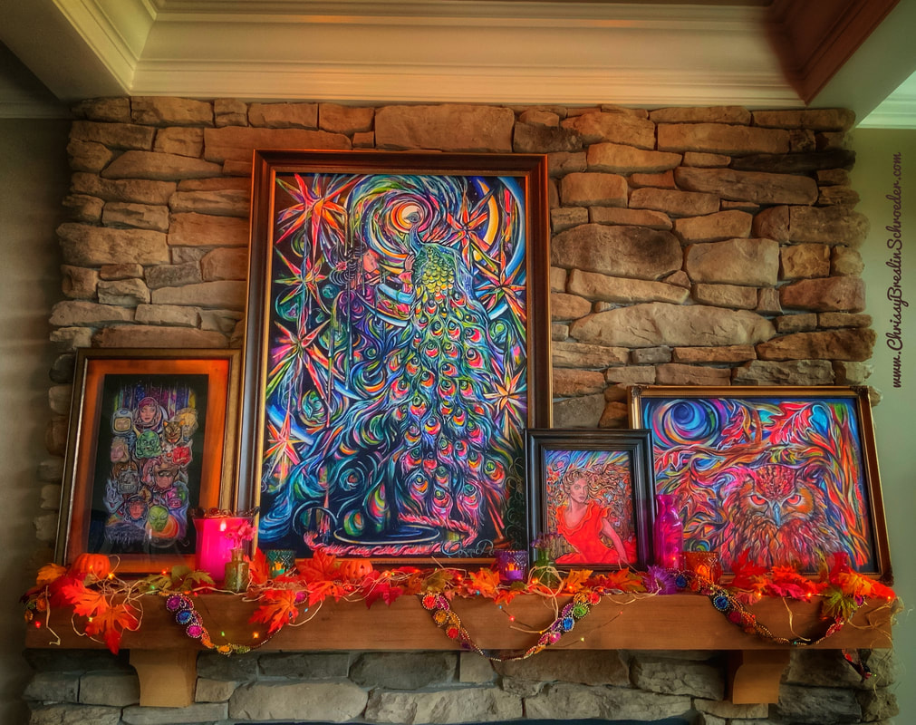 Other blogs from this October 2022: Canvas #11: “Fine Mined Minerals & Spooky Season” Canvas #12: “Six Elements Plus Six Green Figurines” Halloween Top Hat TGIF for this long holiday celebration weekend… Happy Halloween! #HalloweenTopHat 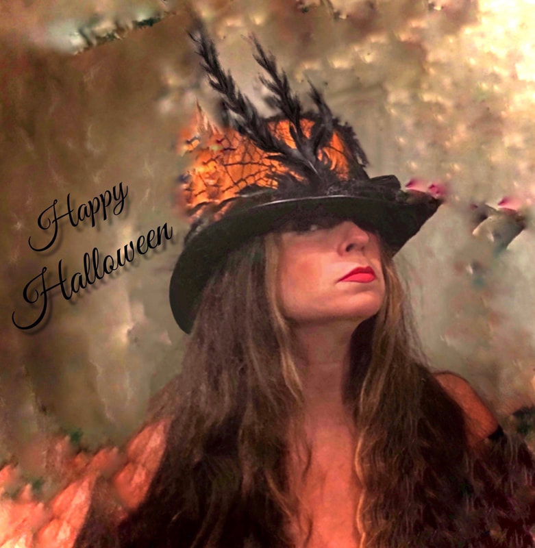 Canvas Number Twelve brings ongoing questions and easily suggests all three elements in this “Twenty Questions”/“Animal, Vegetable, or Mineral” painting project I created. Read about the project through the links listed below: “Is It Bigger Than A Breadbox?” ~ “TV Land”, “Saturn”, “December”, and “Parrot Wallpaper” “March On ~ 2022 So Far” #6 and “A Bonnet, Bouquet, & Bees” 7,8,9, and 10: “Skateland USA”, “Strawberry Fields in an Octopus's Garden”, “Boxes and Butterflies Under a Billowy Cloud for Canvas #9”, and “Sea Turtle Café” “Fine Mined Minerals & Spooky Season” My canvas #12 for this October of 2022 ( in addition to my painted canvas #11 also for this October found in the blog “Fine Mined Minerals & Spooky Season” ) focuses on the elephant and is based on the parable about blind men which touches on the subject of truth or the state of understanding or misunderstanding. Here is a synopsis of the parable I am referring to about blind men and an elephant found through the Wikipedia link: Blind men and an elephant - Wikipedia https://en.wikipedia.org/wiki/Blind_men_and_an_elephant A group of blind men heard that a strange animal, called an elephant, had been brought to the town, but none of them were aware of its shape and form. Out of curiosity, they said: "We must inspect and know it by touch, of which we are capable". So, they sought it out, and when they found it they groped about it. The first person, whose hand landed on the trunk, said, "This being is like a thick snake". For another one whose hand reached its ear, it seemed like a kind of fan. As for another person, whose hand was upon its leg, said, the elephant is a pillar like a tree-trunk. The blind man who placed his hand upon its side said the elephant, "is a wall". Another who felt its tail, described it as a rope. The last felt its tusk, stating the elephant is that which is hard, smooth and like a spear. A review of this parable summary taken from Wikipedia is a reference for my design composition for this twelfth canvas creation. For canvas #12, I continued by then referencing a decades old "back-to-school" issue of a fashion magazine of mine and found this modeling fashion figure that I actually remembered from way back when I got it during my days as a student. This time however, when deciding to paint the girl, I changed her coloring a bit including coloring her jacket in deep blues and purple instead of a grey plaid like the model in the photo was wearing. I also decided to give her an imagined magnifying glass that I conceptually designed with a handle made of ivory. From this old back-to-school fashion magazine photo seemingly made to look like it was taken in a classroom, I replaced a collection of fossils that were against the wall with a posted illustration/painting of a descendant of the now extinct Mammuthus primigenius and the only surviving member of the family Elephantidae. This picture of a mammal that I put in the room may of course be recognized as the presently critically endangered species known as an elephant. Next, on the classroom table or desk in the scene, I painted an additional feature of six little green action toy figurines all in uniform. Finally, to complete the composition while tallying a collection of more animals, vegetables, and minerals, I transformed the hand bags that were being advertised in the magazine spread by turning one of them that I suspect was some kind of real or fake reptilian skinned bag and made it into an action figure sized wall. I then replaced the rest of the purse products with the rest of the isolated elements that the men in the parable mistakenly perceived when attempting to understand or identify an elephant. Canvas #12: “Six Elements Plus Six Green Figurines” 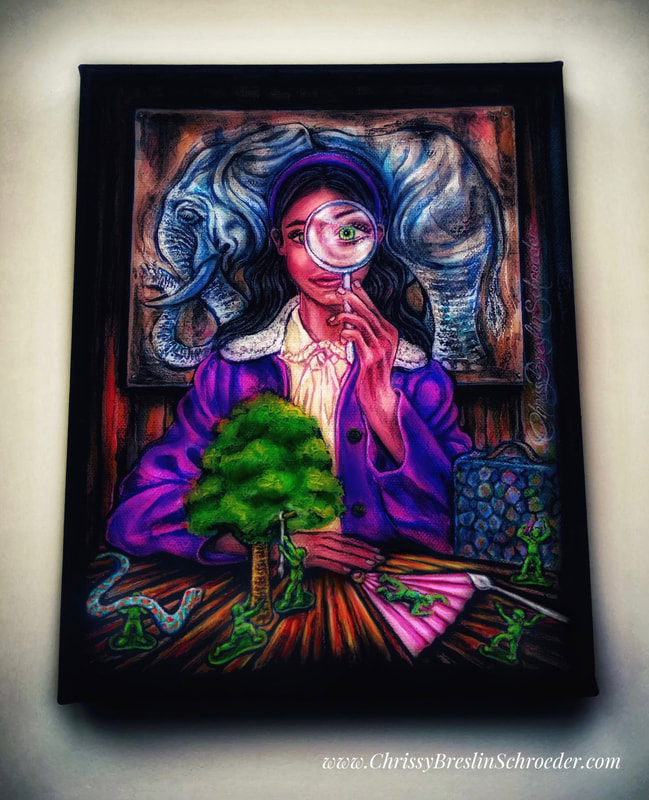 This fashion model is understandably from a long time ago. I found a picture from a 1950’s advertisement featuring a model fashioned with the then growing in popularity "Beehive" hairdo as she highlights pricey jewelry. It is from this 1950’s advertisement for fine jewelry that I created a painting for Canvas #11 in my series of “Twenty Questions”/“Animal, Vegetable, or Mineral?” paintings. An explanation of this painting project I created can be found in the previous blogs linked below: 7,8,9, and 10: “Skateland USA”, “Strawberry Fields in an Octopus's Garden”, “Boxes and Butterflies Under a Billowy Cloud for Canvas #9”, and “Sea Turtle Café” Approaching canvas #11 during this October of 2022, I took the liberty to adjust the model’s exclusive jewelry collection to keep in theme with the spirit of Halloween season that is upon us. Through a little “on-line shopping” to see what is currently on the market, I gathered a collection of some high-end jewelry to paint and shine light on Spooky Season. Using the jewelry as symbols for the collective “Animal, Vegetable, and Mineral” featured elements in this multi canvas painting project, a big pearl and solid gold helped to define the diamond studded spider earrings and create an “animal” feature. For the “vegetable” element, of course this season’s most popular vegetable, the pumpkin, is elevated through the rarest and most expensive of sapphire gems, the Padparadscha Sapphire Stone ( also known as Orange Sapphire ), to create a sparkling and stunning pumpkin carriage brooch. For the third mined mineral gem, an actual symbol of a “mineral” in the form of an American flag styled charm bracelet. Similar to the other jewelry pieces adorning this lady, a Swarovski red, white, and blue exclusive crystal charm import which I found online also carries additional seasonal meaning with the patriotic 2022 “first Tuesday in November” vote casting season coming on the heels of “Spooky Season”. Canvas #11: “Fine Mined Minerals & Spooky Season” 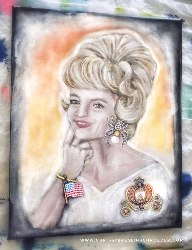 Find an additional blog for this October 2022 and my Canvas #12 in this series of paintings here: Canvas #12: “Six Elements Plus Six Green Figurines” Lately I’ve been continuing the project I created earlier this year. It’s a painting exercise I made-up based on the old fashioned game called Twenty Questions ( also known as the “Animal, Vegetable, or Mineral?” guessing game. ) The design of the painting project that I made for myself to play with is to create a themed collection of canvases that starts with referencing a fashion model from some old magazines of mine. Then, along the lines of the 20 Questions guessing game, recreate a setting or scene with that fashion model that in someway illustrates at least one element that could be classified or understood as an “animal”, at least one element that could be classified or understood as a”vegetable”, and at least one element that could be classified or identified as a “mineral” in each painted composition. Uniquely however, unlike the 20 Questions guessing game where the objective is to narrow down one individual element as an ‘animal’, a ‘vegetable’, or a ‘mineral’, these paintings I created attempt to include all three categories in each imagined art piece. Read about the explanation of my exercise of the 20 Questions game and find the first 6 painted canvases for this specific project I created through the following blog: ”Is It Bigger Than A Breadbox?” ~ “TV Land”, “Saturn”, “December”, and “Parrot Wallpaper” Below are my next painting project compositions for canvases #7, #8, #9, and #10: Canvas #7: “Skateland USA” The Mid 1970’s and the spirit of America’s Bicentennial celebrating the 200th anniversary of the Declaration of Independence became inspiration for this piece. The roller disco era of the ‘70’s gave spirit to this fashion figure that I painted sporting the colors of Americana and placed in an imagined stereotypical roller rink setting with a disco ball prop for the model’s pose. I then styled the girl with a popular hairstyle found throughout the magazines from the 1970’s and had her sport some painted red, white, and blue colors on her tube socks, shorts, jacket, and t-shirt for some clothes that were common in those days. For the *animal(s) in my “Skateland U.S.A.” I painted some snakes. The mirror balls can cover it for the *minerals ( along with the skates and just about everything else in ‘Skateland’ ), and not to miss a *vegetable in this composition I styled the t-shirt with an iron-on transfer of an apple. “Skateland USA” 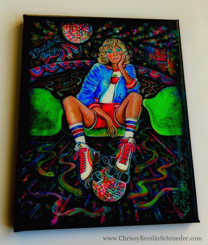 Canvas #8: “Strawberry Fields In An Octopus’s Garden” In review of the old magazines for this project, the name Estée Lauder evidently was big in the 1980’s as their company’s many advertisements can be found throughout the pages of the fashion periodicals from that time period. It was from one of those many classy Estée Lauder ads that I chose a model to be a figure reference for this painting on canvas #8. The photo of this model was found in an advertisement for finger nail polish I think and seemed to highlight some of her eight painted fingers and two painted thumbs. However, for my painting, I decided to fold some of her fingers over and have her hold a basket. I figured the basket can represent a “mineral” for my inclusive “Animal, Vegetable, Mineral” elements. I also figured the basket could be filled with a bundle of strawberries from my painted rolling strawberry fields making this piece plentiful in the category of fruits and “vegetables”. In keeping in tune with my reminded “All You Need Is Love” love of *The Beatles* and “Strawberry Fields Forever”, I also added to the scene a homage to an “Octopus’s Garden” with figments of a floating octopus captured in the scene. “Strawberry Fields in an Octopus’s Garden” 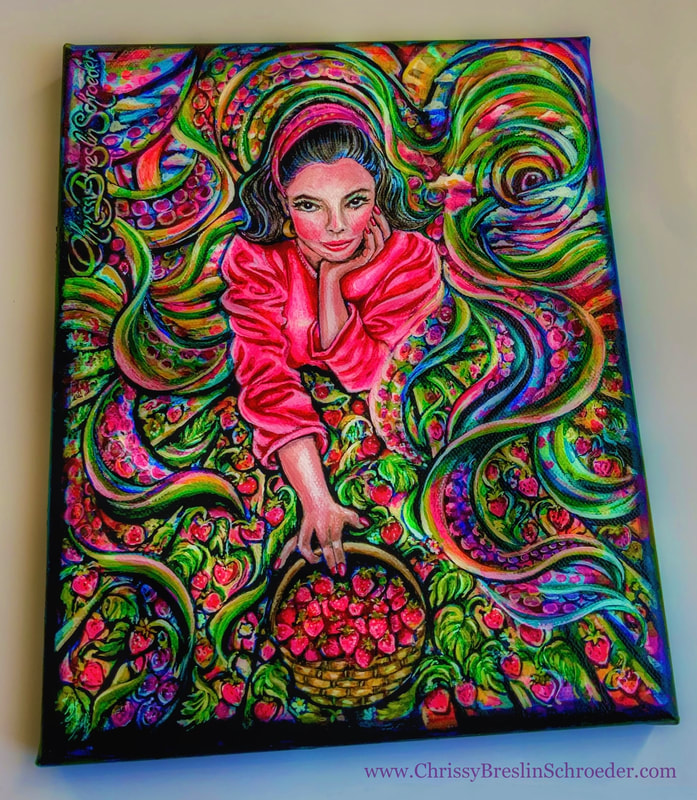 “Boxes and Butterflies Under a Billowy Cloud for Canvas #9” For canvas #9, under a billowy cloud, a fashion figure on boxes with some imagined painted butterflies finding their way through a wooden create’s handle will take care of the *minerals and *animals in this created composition. For the *vegetable category in this cloud 9 piece, I added an impressionistic background with a quick painting of something from my list of favorite things = A countryside filled with colorful wildflowers. “Boxes and Butterflies Under a Billowy Cloud for Canvas #9” 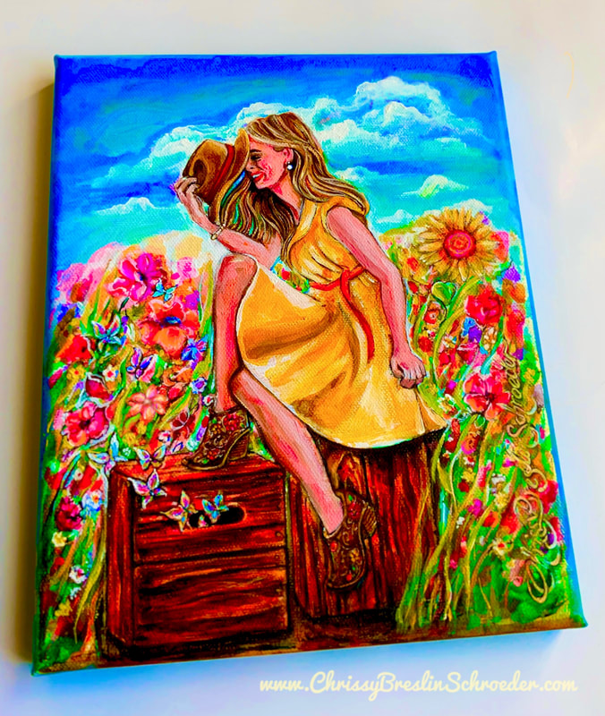 Canvas #10: “Sea Turtle Café” More of my favorite things like tunes and sea turtles can be found in canvas #10. Music is something I pretty much couldn’t live without considering dance has actually always been my favorite art form, and sea turtles are a recent fascination of mine after observing them on a trip to Hawaii with my husband and our sons this past spring. We all just loved seeing the abundant sea turtles there and found them so cool and fun and completely amazing to watch especially when seemingly having the best time just riding the waves along that incredible coast of those beautiful islands. The model in this piece with some 1960’s fashion flair was in a magazine seated in a classic diner that I recreated and transformed into what I dubbed the “Sea Turtle Café” after redesigning it as such by creating wall tiles, an etched window, and a menu all with sea turtle motifs. In keeping with the retro setting, I included an old fashioned portable transistor to tune into some good vibes through the radio waves and to also serve as a mineral element. A slice of tomato and a piece of lettuce that I put on the table alongside some ketchup & mustard and maybe even the groovy daisy flower sunglasses can color the vegetables here. “Sea Turtle Café” 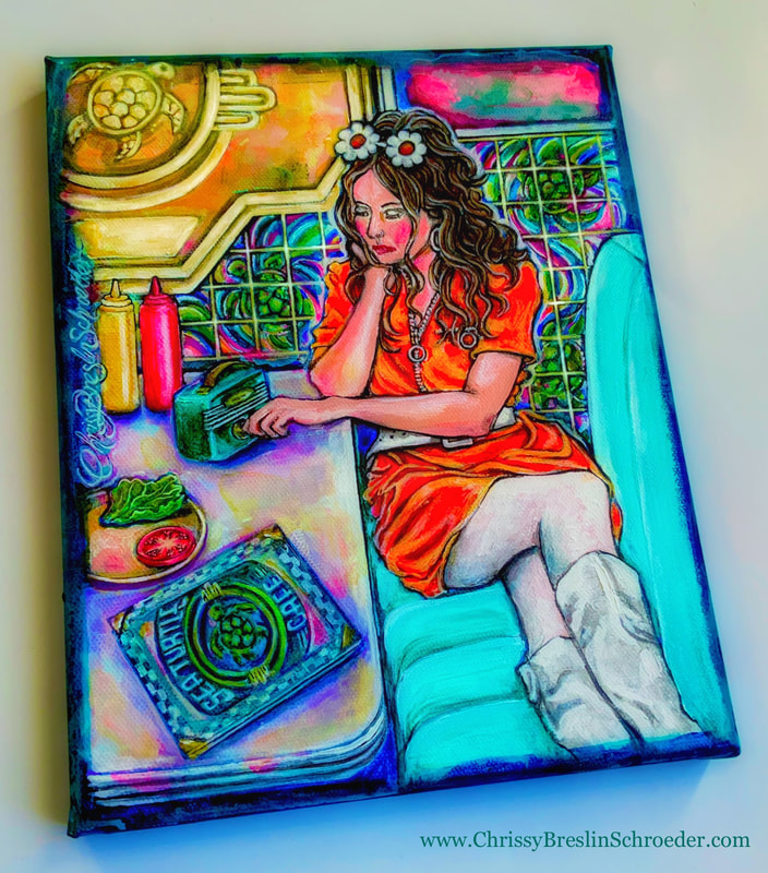 For the next painting in this series, Canvas #11, see my next blog from October of 2022: ”Fine Mined Minerals & Spooky Season” Getting back in my studio this week and came across this old canvas. At the time I started painting it, I believe I was just trying out some new oil paints and never really finished it as evident in the bright base colors in the sand, etc. More textures in the waves could definitely be added as well. ~ I like the expressions on the faces though and am thinking that those were some nice oil paints that I haven’t used in a long time. Amongst other projects, I’m going to get back to finishing my 20+ canvases in my “Twenty Questions / Is It Bigger Than A Breadbox Project”. I think that I will start using those oil paints some more. 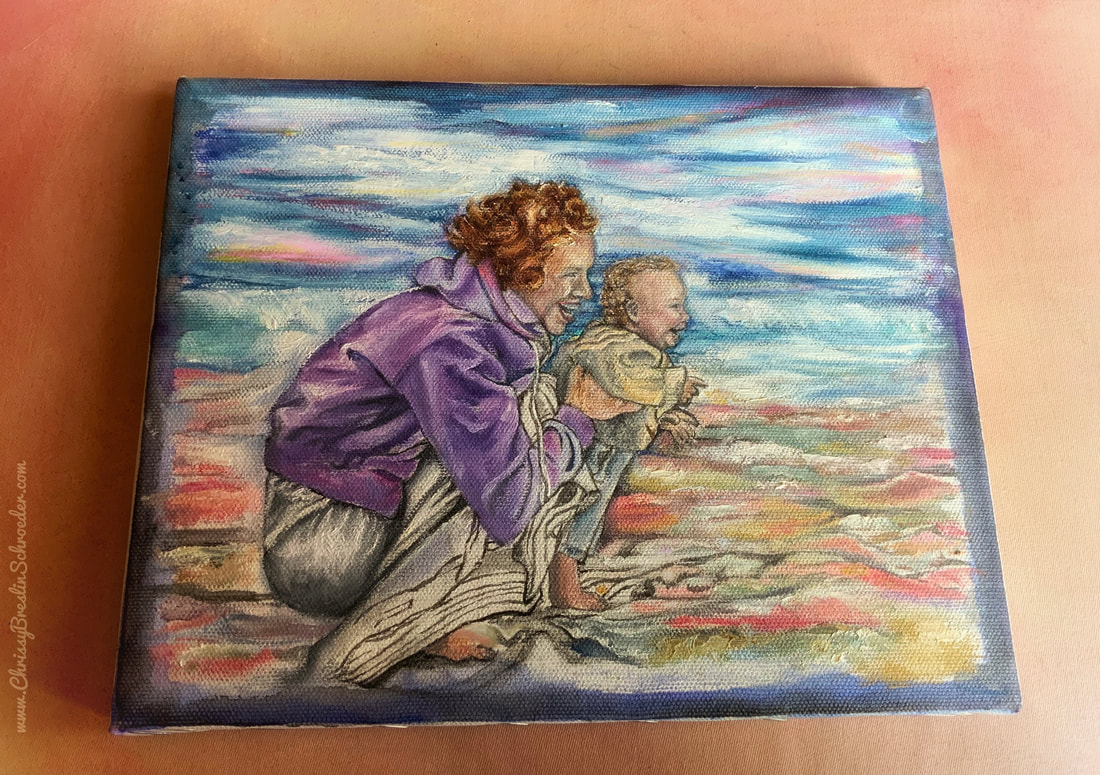 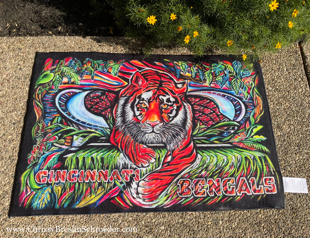 🇺🇸🐅 I’m so excited how vibrant my new patio rug thru Society6 turned out(!) ( …no filter on the pictures ) There is a 4th of July sale running on it in now… See link: https://society6.com/product/bengal-tiger6519376_outdoor-rug 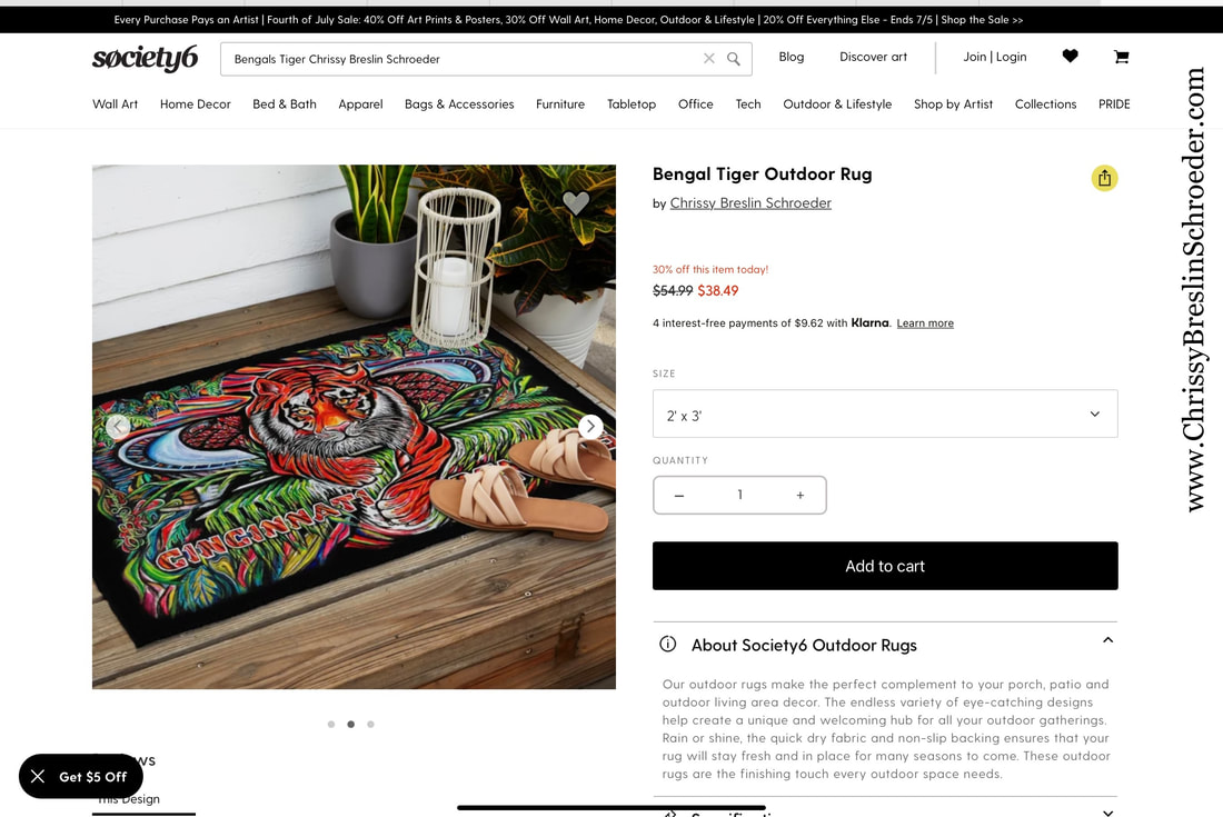 This rug is created from a painting I did years ago and can be used indoors as well since the fabric is soft… 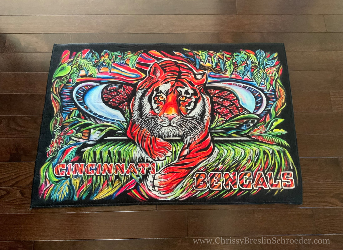 An image from the Facebook page: Cincinnati Reds & Bengals Art by Chrissy Breslin Schroeder: 🐅 🇺🇸 Happy 4th of July Weekend! 🇺🇸 🐅 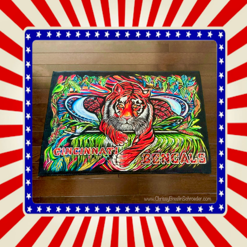 |
AuthorI am a 'self-taught' artist who can hardly remember a day when I wasn't in the process of creating something... Thanks for visiting my site where I can share some of my work. Archives
January 2024
|
 RSS Feed